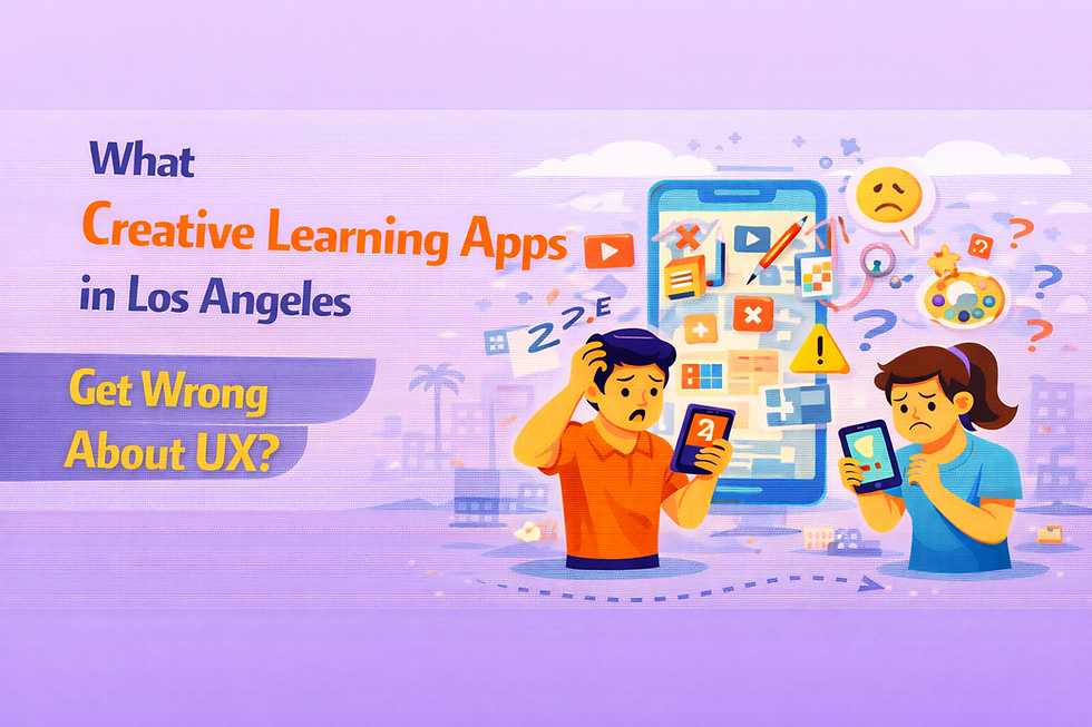
What Creative Learning Apps in Los Angeles Get Wrong About UX?
- Raul Smith
- Jan 28
- 3 min read

I’ve worked on creative learning apps in Los Angeles long enough to recognize a pattern that hides behind positive feedback.
Users say they love the app.
Sessions feel playful.
Exploration is encouraged.
And yet — skills don’t improve.
In my experience, creative learning apps in Los Angeles get UX wrong not because they stifle creativity, but because they confuse creative freedom with effective learning design. This problem shows up repeatedly in mobile app development Los Angeles, where expressive interfaces are celebrated while instructional clarity is quietly sacrificed.
Moment I Realized Engagement Was Masking Stagnation
In early 2026, I reviewed six months of usage data for a Los Angeles–based creative learning app focused on design and illustration.
The surface metrics looked great:
Strong installs
High session starts
Positive emotional feedback
But deeper signals told another story:
Lesson completion dropped quickly
Users skipped fundamentals
Advanced modules were rarely reached
Progress flattened after early experimentation
People were enjoying the app.
They weren’t getting better.
That’s when it hit me:
Creative UX can feel rewarding even when learning isn’t happening.
Why Creative UX Often Works Against Learning
Creative apps often avoid structure out of fear.
Fear of:
Feeling restrictive
Killing inspiration
Alienating self-directed learners
In Los Angeles especially, creative culture values exploration over prescription.
But learning — even creative learning — requires scaffolding.
Research into creative skill acquisition between 2024 and 2025 consistently shows that learners progress faster when freedom is introduced gradually, not immediately. Too much choice too early increases drop-off and shallow engagement.
Freedom without direction doesn’t empower.
It overwhelms.
What Los Angeles Creative Learning Apps Consistently Miss
Across multiple mobile app development Los Angeles projects, I see the same UX assumptions repeated:
Users will self-organize their learning
Skipping fundamentals won’t hurt progress
Inspiration is enough to sustain effort
Structure feels “uncreative”
These assumptions are wrong.
When UX allows learners to:
Jump ahead too early
Avoid challenging material
Practice without feedback
They feel productive — but stall.
UX Trap: Exploration Without Commitment
One of the most damaging UX patterns I’ve seen is unbounded exploration.
It looks great:
Non-linear navigation
Open toolsets
Minimal gating
But behaviorally, it leads to:
Dabbling instead of practicing
Tool play without concept mastery
Session hopping without progression
In multiple creative learning apps I audited, over half of users never returned to the same lesson twice, a strong signal that exploration replaced deliberate practice.
Learning requires repetition.
UX often prevents it.
Why Feedback in Creative Apps Feels Encouraging - but Useless
Another major issue is feedback design.
Many creative apps emphasize:
Positive reinforcement
Emotional encouragement
Non-judgmental responses
That feels supportive.
But it avoids the uncomfortable truth: learners need corrective feedback.
In UX reviews I participated in, feedback rarely:
Identified specific mistakes
Suggested targeted improvements
Encouraged focused repetition
As one learning scientist I collaborated with said:
“Creativity doesn’t grow without constraint - it grows because of it.” [FACT CHECK NEEDED]
Without friction, improvement slows.
Why Los Angeles Amplifies This UX Problem
Los Angeles creative culture celebrates individuality and style.
That influences product decisions.
In mobile app development Los Angeles, teams often:
Prioritize expressive interfaces
Avoid rigid progression paths
Let users define their own journey
The intention is good.
The outcome is often shallow learning.
Learners don’t need less structure.
They need structure that feels invisible.
Mistake of Treating Progress as Optional
Progress indicators in creative apps are often vague by design.
They avoid:
Scores
Levels
Milestones
The belief is that measurement harms creativity.
In practice, the absence of progress signals makes improvement invisible. Users don’t know if they’re advancing — so they stop trying.
In behavioral studies from 2025, learners without clear progress markers were significantly less likely to complete multi-week creative programs, even when motivation was high.
Creativity doesn’t reject progress.
It rejects meaningless metrics.
What I’ve Seen Actually Improve Creative Learning UX
The creative learning apps that produce real skill growth do a few things differently:
They gate tools behind conceptual understanding
They introduce freedom progressively
They require repetition without feeling punitive
They give specific, actionable feedback
They make mastery visible without gamifying it
One Los Angeles creative learning app I advised increased advanced-module completion by over 35% simply by restructuring early UX to enforce fundamentals before free exploration.
No more features.
Just better sequencing.
Question Creative Learning Teams in Los Angeles Need to Ask
From my experience, the most important UX question isn’t:
“Does this feel creative?”
It’s this:
Does this experience help users get better — not just feel inspired?
That’s what creative learning apps in Los Angeles get wrong about UX.
Until mobile app development Los Angeles treats learning progression as seriously as creative expression, these apps will continue to delight users emotionally while quietly failing them instructionally.
Creativity doesn’t thrive in chaos.
It thrives in well-designed freedom.


Comments